Tutorial: How to vertical align center on the screen while scrolling with CSS

I believe some of you out there also faced this problem where your container is align on the center of the screen but when the screen is too long, the scroll bar appeared and your box remained on the top of the screen and you say "oh shit!". Searching all over the internet and found only how container can be align on the center of the screen but not when it was scrolling? I think this article will solve your problem.

The Problem

We are assuming here that you have aligned your container at the center of the screen with position absolute. If you are still having this problem, you may want to visit How to align center on the screen when using position absolute with CSS. Once your container has aligned on the center of the screen. You meet the problem of having it follow you while you scroll down the screen. I like to say that the container is not persistence enough! Let's make it persistence to follow your scroller.

The Concept

Basically, you can solve your container not aligned on center while scrolling with the following concept:

  • You can create a code of jQuery/JavaScript to accomplish this by making your container chasing after your scroller. Thus, changing the container position on every scroller movement. (not good)
  • The other way is to just CSS (which we are doing) to cheat the above effect. Instead of chasing after the scroller, we fixed the position on the center of the screen while having absolute to cover all other elements!

We will be doing the second approach which is more efficient and is the more correct way of doing. The reason why it must be position fixed is that the container should not move! Thus, stay at the center of the screen when you scroll. As for the reason why it must also be position as absolute is because we need to cover up all element below to prevent any user from clicking on the elements!

The Solution

The Trick is fairly simple after you have accomplished your center alignment on the screen with absolute position. I take the following code from the article and change it so that the container will remain center while scrolling.

#box
{
	width: 150px;
	height: 150px;
	background: red;
	padding: 5px;
	border: #CCC solid 1px;
	text-align: center;
	position: fixed;
	margin-left: -75px;
	margin-top: -75px;
	left: 50%;
	top: 50%;
	
}

The above is the one was in the article given in the link. Now i will just change the styling a bit to red and size accordingly and the new code that will make it remain center will be as follow,

#box
{
	width: 150px;
	height: 150px;
	background: #000;
	padding: 5px;
	border: #CCC solid 5px;
	text-align: center;
	position: fixed;
	margin-left: -75px;
	margin-top: -75px;
	left: 50%;
	top: 50%;
}

The main changes done was 'position:fixed' which fixed your container at the center of the screen whenever it go! Persistence enough.

The Demo

The following links are the demo for persistence and non-persistence container:

10 different ways to fully utilise the blend tool in Adobe Illustrator

I've talked about how amazing and underused the blend tool in Illustrator is. Here are ten ways to fully utilize the blend tool to create many different kinds of effects in Illustrator.

Blend and mask yourself a great poster

Blend and Mask Yourself a Great Poster - Vectortuts+_1248254360961

Do you think it's difficult to create a poster with an effect just like the one above? Think again! It's really not. The blend tool was used to create the swirly effects in the background of the poster which would have otherwise been dull and flat.

Illustrator Blend Tool Tips and Tricks

Illustrator Blend Tool tips and tricks — Gurus Unleashed_1248254594841

Over at Guru's Unleashed, the tutorial teaches you how to edit the blending spine so you can blend in curves or in any other direction that you would like.

Illustrator's Blend Tool: A Comprehensive Guide

Illustrator’s Blend Tool- A Comprehensive Guide - Vectortuts+_1248254852526

This guide teaches you how to blend with various shapes and gradients, applying blends along a path, replacing spine option, replacing a spine or creating highlights like the picture above. Very useful and reccomended for beginners who did not know the full potential of the tool.

Creating a Stylish Vector Flower

Stylish Vector Flower_1248254509264

The blend tool technique makes creating vector images like the flower above VERY simple to do- not to mention that it looks great. NDesign studio teaches you how.

Creating Vector Gradient Patterns

Tutorial- Creating Vector Gradient Patterns - TheVectorLab Blog_1248254455784

Creating vector gradients like the ones above is easy! All it takes are four steps and there you have it. The vector lab shows you how.

Once the blend tool has been sufficiently mastered, it can be incorporated with other tools to create other images such as the ones below.

Swirl mania in Illustrator

Young_designerZ- Swirl Mania in Illustrator & Photoshop_1248254967449

The swirls and spirals in the picture can be created using the blend tool along with the pattern details on them.

Che Mondo Bello: Tutorial in Illustrator Blends

Che Mondo Bello- Tutorial- Illustrator Blends_1248255574999

Again, this image shows a perfect example of how an image is livened up with the details in the background created with the blend tool.

Amazing Illustrator 3D Effects

Illustrator Amazing Illustrator 3D Effects And PS Brush Creation Tutorial - Online Tutorials. Online Photoshop Tutorials, Online Flash Tutorials. Submit Tutorial_1248255465986

Starting with a relatively flat image of a text, by using the blend tool, a 3d effect can be obtained. With a little help from Photoshop, the result is the image such as above.

Creating an abstract flower using Blend Tool

Photoshop Blog- Abstract Flower Colors Light with Blend tool photoshop_1248255875762

This tutorial is a step-by-step article on how to create an abstract flower such as the one above using the blend tool. I particularly liked this one the best. A great example of a simple and yet so beautiful image that is easy to do.

Creating gradients with the blend tool

Dabbling in Design » Blog Archive » Blending, shading and the blend tool in Illustrator_1248255956421

The jellybeans above all look relatively 3d with the help of the blend tool which would have otherwise been a very flat image.

Tutorial: How to make your own simple and nice Slider with jQuery

Well, this is not new and can be easily found on jQuery UI but you will have to download jQuery UI and use it as if it is a plugin. But for my case, i wanted to find out and construct an easy and nice slider for myself. Many will skip this step and use jQuery UI instead. But when it come to customization for vertical slider, it may come to a good use for developers or even designers to know how this is being made (you can look into the code of a plugin but it will definitely take more time).

The Problem

I am currently building a gallery similar to the current Slider Gallery plugin. But i wish to know how slider can be achieve easily without using the existing plugin or library (learning purpose). The gallery can have vertical or horizontal slider and customize the outlook to my personal need.

The Solution

I can use the existing jQuery plugin or study them to construct a jQuery slider easily. But plugin codes contain many DOM manipulation to construct HTML structure automatic in order to ease the job needed for developers or designers. In return, we eliminated the efficiency of the website because of the extra codes required in the plugin to do things automatically. Personally, i will prefer something simple and easy to understand for future enhancement and maintenance by myself (i believe majority developers or designers will love simple stuff to work with). Thus, i brainstorm something similar to a slider which might not have the same concept as jQuery UI (i never actually look at it) but should be around the same.

The Concept

Before we go into the actual coding, i like to write a small concept out for myself to understand this in the future. Basically, we need two things in a slider, the scroller and scroll bar. But this two things are not enough. There is a need for an outer container to place these two. Why? Because we need to align both scroll and scroll bar together. Therefore, both the scroller and scroll bar will have to be position in absolute. The most outer container will be position relative to prevent the absolute positioned containers from getting out of the constraint area. So we will have something as shown below,
illustrate
In order to move it accordingly, we will move the variable 'left' since the scroller is positioned absolute and use variable 'top' if we are moving vertically.

The Code

The code will be split to three part, HTML, CSS and jQuery. This is best to simplify the overall concept.

HTML

The HTML code is fairly simple and straight forward. We will create the three container which were mention on the concept section as shown below,

	<div id="scrollcontainer">
		<div id="scrollbar">
		</div>
		<div id="scroller">
		</div>
	</div>

i have placed the id for each container so that we can manipulate them when we come to jQuery coding. Short and clear.

CSS

In the CSS, this play a much bigger role as most of the display is done in here. For the outer container we will just need it to be set to display:relative, provide a width and align to center. For scroller and scroll bar will required more declaration.

#scrollcontainer
{
	margin: 0 auto;
	text-align: center;
	position: relative;
	width: 907px;
}
#scrollbar
{
	width: 907px;
	height: 40px;
	position: absolute;
	top: 0;
	left: 0;
	background: transparent url('../images/scrollbar.png')  no-repeat;
}
#scroller
{
	background: transparent url('../images/scroller.png') no-repeat;
	width: 196px;
	height: 40px;
	position: absolute;
	left: 0px;
	top: 0px;
}

Basically i set my scroll bar width and height so that the image can be placed into it. Finally, the container with the scroll bar image is set to position absolute with the top and left set to '0' in order for all browser to align properly ( or else you will see IE having problem). Similarly, the scroller part was also being done in this way. Simple enough.

jQuery

As usual, this is the most complex part which you should focus more. We will need to define some variable before we attached any event handler and other operation.

	var myoffset = $('#scroller').offset();
	var myxpos = parseInt(myoffset.left); 
	var width = parseInt($('#scrollbar').css("width")) - 196;
	var action = false;

We will need to declare the above variable so that we can easily maintain them when required without manipulate the inside logic of the slider. The variables are explain below,

  • myoffset: this is the offset position of the 'scroller' container. Similarly, this object return contains 'scroller' position
  • myxpos: using 'myoffset' object, we retrieve the 'x-axis' position
  • width: this is the actual width of the scroll bar (we substract 196 because the scroller width is 196px)
  • action: this is to indicate whether the scroller was clicked and holded

Now we will have to grab the coordinate of the mouse position and attach the event handler required for the slider to work.

	$().mousemove(function(e){
		
	})

The above will gives us the position of our mouse coordinate. Now will will look at the overall code within mousemove declaration.

	$().mousemove(function(e){
		var move = parseInt(e.pageX-myxpos);
		
		$('#scroller').mousedown(function(){
			action = true;
		})
		$('*').mouseup(function(){
			action = false;
		});
		
		if(move <= 0)
			move =0;
		if(move >= width)
			move = width;
		if(action)
		$('#scroller').css("left", (move)+"px");
				
	})

The 'move' variable gives us the real mouse position. Since the most left of the screen will gives us '0px' but it is not necessary that the scrollbar will always be at the most left of the screen. It can be at the center of the screen where the position of its starting point is also '0px'. Thus, we will need to subtract away the distance between the scroll bar containers and most left of the screen. Short to say, our mouse X coordinate will always be bigger than our scroll bar X coordinate. So we will have to make it similar by doing some subtraction.

The 'move' variable is troublesome explanation, let's move on. We attached two event handler to mousedown and mouseup to detect whether the user clicked on the 'scroller'.

Finally, we will detect whether the 'real mouse position' has moved over the constrained area and set the 'real mouse position' to the minimum or maximum of the area (indicate black on the concept section image). This is required so that it can move smoothly when it reaches the end of the scroll bar. We also use the variable 'action' to detect whether the 'scroller' was clicked before it is able to move.

The overall jQuery code for a slider to work is as follow,

$(function(){
	var myoffset = $('#scroller').offset();
	var myxpos = parseInt(myoffset.left); 
	var width = parseInt($('#scrollbar').css("width")) - 196;
	var action = false;
	
	$().mousemove(function(e){
		var move = parseInt(e.pageX-myxpos);
		
		$('#scroller').mousedown(function(){
			action = true;
		})
		$('body').mouseup(function(){
			action = false;
		});
		
		if(move <= 0)
			move =0;
		if(move >= width)
			move = width;
		if(action)
		$('#scroller').css("left", (move)+"px");	
	})
});

P.S: This is just a simple version on how slider can be done. It can definitely be improved! But this is just to illustrate a Silder for your understanding.

P.S: The full version without using jQuery Plugin or UI can be found at Tutorial: How to make your own simple and nice Slider with jQuery part 2

The Demo

The explanation might not work for you let's look at the demo i prepared which locate at jQuery slider demo, the image can be seen below,
jquery-slider-demo
Unfortunately, i did not make the container dynamic (means you can move them around) to test the important of the 'move' variable as describe above. Nonetheless, you can always download the demo down to your local PC at jQuery Slider demo files and modify the CSS position to test the slider! Hope you learn something too!

Tutorial: How to create an image navigation bar with CSS

There are times when we want to build a navigation bar for ourselves in the simplest form. Especially when we want an image on top of an image or below an image but perform it with many many redundancy codes made in HTML, CSS or even involved JavaScript. What i am going to demonstrate here is a simple yet powerful method we can all use in CSS to create such navigation bar that attached an image on top of it.

The Problem

I wanted to create a navigation bar that will display an image when hover on it and display when it is not being hovered.

The Concept

The solution to this problem is fairly simple but usually over complicated. We want an image and a word to be placed together in the same row and column on the navigation bar. Some people will do this with the following methods:

  • Create a two row of div block align them perfectly top to be image, bottom to be word
  • Use jQuery or JavaScript to assist with the effect and display of the image
  • Use position absolute to align it on top of the image
  • The list goes on..

To be honest, what we really need is just an unordered list with some CSS. What we do is to stretch the list box so that it can contain an image and place a anchor as the child of the list. This way, the image can be display on the list box as background while the word will always be display as it is. Simple and sweet.

Solution

I will split this into two section as this is all we need to accomplish this effect, HTML and CSS.

HTML

			<ul id="content-nav">
				<li class="boxes" id="0"><a href="#">HOME</a></li>
				<li class="boxes" id="1"><a href="#">ROCK</a></li>
				<li class="boxes" id="2"><a href="#">BAD</a></li>
				<li class="boxes" id="3"><a href="#">TIME</a></li>
			</ul>

Assume we have an unordered list as shown above in HTML. Now we will use CSS to demonstrate how it can be done.

CSS

#content-nav
{	
	list-style: none; /*removes the underline below the link*/
	padding: 0; /*removes the padding*/
}
#content-nav li
{
	
	float: left; /*this makes the element displays in a horizontal line*/
	width: 50px; /*This allows the picture to be fit in the block*/
	height: 50px; /*This allows the picture to be fit in the block*/
	margin-left: 50px;
	cursor: pointer;
	
}
#content-nav li:hover
{
	background: transparent url(../images/1.png) no-repeat top center; /*this makes the picture appears in the top center without any repeats*/
}
#content-nav li a
{
	color: #777;
	display: block;  /*The element will be displayed as a block level element */
	width: 50px; /*This allows the picture to be fit in the block*/
	padding: 50px 0px 5px; /*There is 60px of padding on the top, 10px of padding on the right and left, and 5px of padding on the bottom*/
	text-decoration: none; /*removes all text decoration*/
}

What we do here is to remove all styling on the anchor so that it won't display any underline etc. Then, we set the anchor to display: block so that it will go to the next line after the image appeared. but we will have to provide a space for the image. Thus, padding is used instead. The description i am talking about is located at #content-nav li a. We set the background image when hover with this CSS declaration #content-nav li:hover. Others should be self explain stuff.

Demo

You can view the demo site at CSS image navigation bar with CSS. It will display the image when mouse hover. Cheers

Tutorial: How to access WordPress plugin Subversion repository

This article is dedicated for WordPress developers who has never used Subversion before and wanted to release their plugin to the public. Once you have submitted a form to WordPress. They will reply you with a email that contains your WordPress Subversion repository link. You do not have any knowledge of WordPress Subversion repository and don't know where to upload your new WordPress plugin to share with the public. You started searching for a solution around the internet for Solution without having any luck. Sad. Well, i go through that because i am those confuse people around the world who can't just read and read the whole article written with pure English. So here, some image picture for you to learn to access WordPress plugin Subversion repository. You can also read the whole Subversion book given by WordPress tutorial in command line.

Requirement to access WordPress Subversion

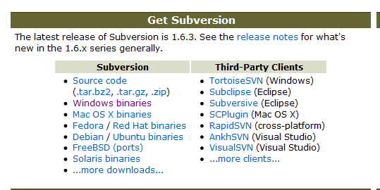
There are two ways of accessing WordPress plugin Subversion repository. The first one will be using pure command line instruction and the other way is to have a Subversion Client. I will show you the easy way to make life easier (the client is built for this purpose). Look at the picture below on Subversion website where all Subversion Client exist for different platform.
subversion-client-location Download one of them depending on your platform and installed it to your system.

Working with Subversion Client

For this article, i will use TortoiseSVN for Windows users. You will have to fire up the installed TortoiseSVN on your PC and it will show you something like that below,
tortoise-alert

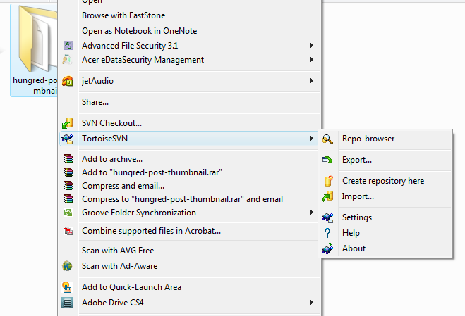
The application is informing you this is not the way to use Subversion repository. The correct way is to find the folder you wish to upload right-click it and select the application from the menu as shown below,

import-subversion

You can use the import function shown above to import straight to your Subversion repository or clicked on Repo-browser to upload them one by one. After you have done that just follow the instruction given by WordPress on where to upload the respective files to and you are done. Wait around 15--20min before it will show up on WordPress plugin search functionality. After this, use that particular folder to make your changes and work on your plugin in the future. After every changes you can just clicked on the same folder and pressed commit. If anything happen you can revert back your version from your previous committed version to see what you have changed. After you have all done with the new version do the same by copying to the Tag folder. Remember the to update the Stable tag in your readme.txt to reflect the changes.

P.S: you will only need to upload once in trunk and copy those files to tag/x.x.x.x to reflect the current version to your users. trunk is the version you will be working on and tag will be the one that inform others about your latest fixed/update on your plugin