Installing CSS Tidy For WordPress W3 Total Cache Plugin

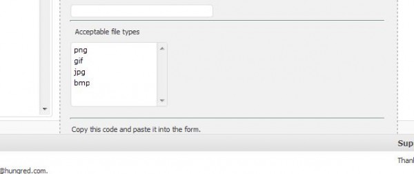
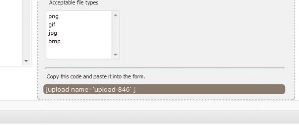
In my previous two article where i explain how to install Memcache and HTML Tidy for WordPress W3 Total Cache plugin, i forgotten about CSS tidy as shown below,

CSS Tidy allows the server to minimize your CSS without you doing it yourself. However, this largely depend on whether your web hosting provider had installed it for you. Nonetheless,  it is a great additional for every webmaster to have!

Installing CSS Tidy For WordPress W3 Total Cache Plugin

Installing CSSTidy is quite simple on a centos linux machine. All you have to do is to issue the following command.

yum install -y csstidy.x86_64

If its successfully installed, it would really be that simple. However, if you can't find this option, it will be time to do some work.

Installing CSS Tidy alternative

Since the simple step wasn't there for you, we will have to try something manual. Fire up the below command,

rpm -ivh http://download.fedora.redhat.com/pub/epel/5/x86_64/csstidy-1.4-1.el5.x86_64.rpm

and see whether it went successful. If it does, csstidy is installed. If it doesn't try download it and rpm again.

wget http://download.fedora.redhat.com/pub/epel/5/x86_64/csstidy-1.4-1.el5.x86_64.rpm
rpm -ivh csstidy-1.4-1.el5.x86_64.rpm

If it still doesn't work, you should find it on your yum using the following command.

yum install -y csstidy.x86_64

since the rpm was added into your repo. Hope it works 🙂

IE6 solution for position absolute with height 100% dynamically

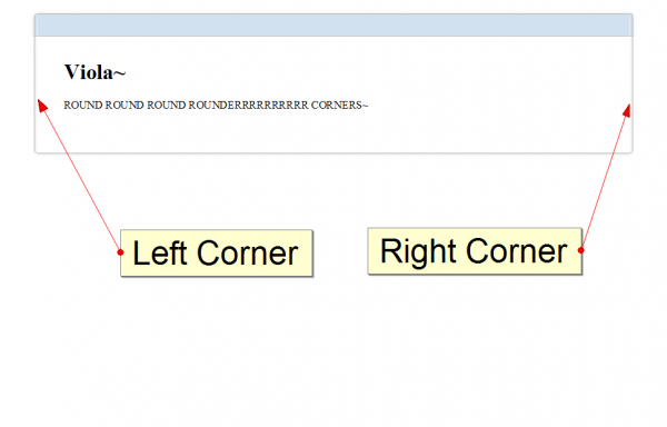
I was working on a rounded corner solution that required to supports IE 6 and other major browsers with the number of sprites images given to me. Everything works perfectly until i test the css rule with IE 6. The look very nice layout was literally destroy by IE6. So i have to redesign it slightly so that it works nicely across all browser. Well, supporting IE6 is definitely not one of my favorite things to do for css design as there are many problems one will encounter due to the inconsistency ways of how each browser is being implemented. One of the problem that i encountered doing this was to get my left and right shadow border image to repeat itself on the y axis. The problem was it doesn't even repeat itself! 🙁

Problem with IE 6 Absolute Position with Height 100%

Soon, i found out that it was due to how IE 6 sees the current div block height. I was trying to set the div block of the left and right side shadow to fix into the content of my rounder corner solution as shown below,

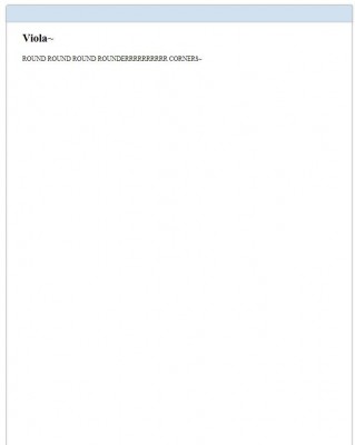
This is something that i took with Firefox, let's look at IE 6 display!

Well.. this is not the actual messed up code that i initially saw but the one that i have completed with a bit of code taken off.  Notice that the side sprite images did not repeat itself. This is not due to IE 6 incompatible with css, background-repeat rule. This is purely how IE 6 behave when your div block has absolute position rule intact with it. Let's look at the code of both my CSS and HTML code.

<div id="box-container">
	<div id="box">
		<div class="tlc"></div>
		<div class="trc"></div>
		<div class="blc"></div>
		<div class="brc"></div>
		<div class="t"></div>
		<div class="b"></div>
		<div class="l"></div> <!-- Left shadow -->
		<div class="r"></div> <!-- Right shadow -->

		<div id="content">
			<h1>Viola~</h1>

			<p>
				ROUND ROUND ROUND ROUNDERRRRRRRRRR CORNERS~
			</p>
		</div>
	</div>
</div>

The above are the structure i used to construct my rounder corner solution where the tag for left and right shadow is displayed above. Now, let's look at the two shadow CSS declaration.

#box
{
	margin: 15px auto;
	text-align: left;
	width: 55em;
	word-wrap:break-word;
	overflow: hidden;
	position: relative;
}
.l, .r
{
	height: 100%;
	position: absolute;
	width: 10px;
	z-index: -1;
}

.r
{
	background: #FFF url(images/pnl-sides.png) repeat-y 9% 0%; /*set the right border image*/
	right: 0;
}

.l
{
	background: #FFF url(images/pnl-sides.png) repeat-y 90% 0%; /*set the right border image*/
	left: 0;
}

The above left and right shadow works perfectly as shown on Firefox/Chrome/Safari but fail on IE 6. This is where the problem comes, Height:100% on a position absolute div do not work on IE 6? Well, it does work since i solved this. The trick is to provide its parent a height value as the child does not know how long its height was so it will keep looking for its parent to determine the div block height. In this case, my left and right shadow div block parent was "box". Here, i set my box div block css as follow,

#box
{
	margin: 15px auto;
	text-align: left;
	width: 55em;
	word-wrap:break-word;
	overflow: hidden;
	position: relative;
	height: 100%; /* this is added for ie6 */
}

Notice the differences between the first box declaration and this. We have just added height 100%. Below shows the result of our modification.

There! I fixed it in IE 6. But wait! We have another problem. Now, all browser are rendering similar view with height 100% but i want it to fixed dynamically according to the content not the whole height of the browser. We can fix other browsers by adding the following sentence as shown below,

#box
{
	margin: 15px auto;
	text-align: left;
	width: 55em;
	word-wrap:break-word;
	overflow: hidden;
	position: relative;
	height: auto !important; /* this is added to fixed all other browser dynamic height problem */
	height: 100%; /* this is added for ie6 */
}

After we added this css rule, all other browser should work correctly. It seems like IE 6 doesn't recognized !important for height attribute and only takes the latest declared height for its css height in this case, height: 100%. Other browser which worked correct will utilized the !important rule instead. This way we can assure that all other browser render our height dynamically according to the content of our text! Wait! How about IE 6? Oh yes, we still have this trouble maker that we need to take care of. The trick to solve the problem of IE 6 being dumb by taking height 100% as the whole document height is to create another parent above our "box" container which i have already created which is called "box-container". Now, for our "box-container" css, we will place the following rules:

#box-container{
	height: 100% !important;
	height: 1px;
	min-height: 1px ;
}

This will give "box" a given height to follow and cause IE 6 to resize dynamically according to the amount of text you have given in your content block. Now, i finally have a cross browser working solution for my work 🙂

jQuery and JavaScript CSS !important

Everyone who is familiar with CSS !important statement understood that it means that the style have the highest priority regardless of other priority. However, !important should be avoided as much as possible and order priority should be practice in CSS instead. In jQuery, there are times when we need to change the styling of our web program but programmers usually lack of such knowledge and inquire whether !important is available for jQuery css() method. In this article, we will discuss jQuery css() and JavaScript methods in term of using !important definition.

jQuery CSS !important

One thing that everyone must have wonder (those that haven't tried yet) is whether jQuery support declaration of !important for their css() method such as this.

jQuery('#id').css('height', '200px !important');

You will find that nothing will happen with a declaration of such manipulation. If we were to try out on pure JavaScript with the above declaration, it will be something like this.

document.getElementById('id').style.height = "200px !important";

Having a pure JavaScript instruction such as this will not work in most browser other than safari 3++. Hence, jQuery will definitely won't work too. This is not a bug but something that most browser doesn't acknowledge a need since inline style already have the highest priority other than user defined ones. (unless you do not want your user to change how they view your website).

Solution to jQuery CSS !important

Well, the typical way of getting !important will not work. Rather, you might want to try CSS DOM cssText. Hence, you will force !important to your jQuery statement by doing this.

jQuery('#id').css('cssText', 'height: 200px !important');

However, most people will be unfamiliar with cssText. cssText will overwrites the css of that particular element. Hence, you will have to redeclare the rule for that particular element all over again. On the other hand, if you are using JavaScript cssText, different browser treat cssText different such as ie you will define this way,

document.getElementById('id').style.cssText = 'height: 200px !important'

While normally you will use it this way.

document.getElementById('id').cssText = 'height: 200px !important'

Definitely, there is a better alternative such as using the cssRules/rules array which can specify the rule in that element to be modify.

The other more practical way of doing it is by introducing new class for your element. Instead of styling through jQuery or DOM object which is applying inline styling (means highest priority already), you should leave every majority styling or best all of the styling to an external style sheet that help you reduce some bytes on the script and also improve maintainability for both your code and style. You can do this using the toggleClass which adds a new class to that element automatically.

jQuery('#id').toggleClass('classname');

or you can do this in JavaScript by replacing the class (this is more efficient than the jQuery one since there isn't any additional checking and stuff)

document.getElementById('id').className = 'classname';

Summary

Using !important in CSS is not advisable since it might kill your web usability. Furthermore, there is no reason why !important should be use as inline styling already has the highest priority. Hence, you might want to reconsider applying !important on your script after thinking about the consequences that might bought to your users.

Inline, Internal or External CSS Style Print First?

It is a common thing for most web beginners to wonder which style will the browser print first when we declare multiple style. Although i have explain previous on the order priority of CSS, i forgotten about the importance of inline, internal and external CSS style that both designers and developers might wonder when they started on web.

Inline CSS

The inline CSS also refer as embedded style is usually mark as the highest priority over internal or external style. An inline style has the highest priority among others but the style can only be apply to an individual element. Here's an example

<div style='height:200px;width:200px;text-align:center;'>Click me!</div>

Inline style may be convenient to write but maintenance work will definitely kill you one day.

External CSS

The external CSS which the style is usually placed on an external file will usually have the lowest priority over these three type.

<link rel="stylesheet" type="text/css" href="http:/hungred.com/external.css">

Nonetheless, sometimes external CSS can have higher priority over the internal CSS in some circumstances.

Internal CSS

Internal CSS are definition declare inside of the HTML document with the style tag,

<style type='text/css'>
div{
height:200px;
width:200px;
text-align:center;
}
</style>

Internal CSS usually have the second highest priority among them. However, it will lose its priority if the external stylesheet declaration is placed at after the internal CSS. Hence,

<link rel="stylesheet" type="text/css" href="http:/hungred.com/external.css">
<style type='text/css'>
div{
height:200px;
width:200px;
text-align:center;
}
</style>

the internal CSS is after the external CSS. Therefore, the internal CSS has a higher priority. On the other hand,

<style type='text/css'>
div{
height:200px;
width:200px;
text-align:center;
}
</style>
<link rel="stylesheet" type="text/css" href="http:/hungred.com/external.css">

when the external CSS is after the internal CSS, the external CSS will have a higher priority.

Priority Sequences

Hence, we can produce a priority sequences of how CSS prioritize our CSS types.

  1. User Style
  2. Inline Style (inside HTML tag)
  3. Internal Style (usually on the HTML head section)
  4. External Style
  5. Browser Default Style

User style (the style that user define for your website) have the highest priority over all other types but as a developer or designer we should only worry about the priority given on inline, internal and external style. Nonetheless, it is also important to know that using !important will also mean that user style priority is overwrite by the HIGHEST priority (which is style declare with !important). That is also the reason why we should try to avoid the use of !important as a developer or designer to avoid any usability problem and utilize order priority in CSS.

Summary

Once we understand how order priority work in CSS, we can easily figure out how CSS cascade all our different styles into one. But one last thing to take note of. The order priority in this link only apply to internal and external style. Hence, if both internal and external have the same exact style definition which order priority in this link will CSS take as the highest priority. The answer lays in this article where we explain on the internal CSS section.

Various Ways To Fix Container Height To Float Element In CSS

Float in CSS is something every web designer or font-end developer will come across very frequently in a normal web development process. Especially when web designers are trying to layout a particular element into a CSS design. But laying out float element might not always be smooth sailing. Nonetheless, solutions can be easily spotted. Personally, I was having a few problems with my floating element being floated out of the container as shown below,
problem

After some research it seems like there are various ways we can fix this problem so that the container will takes the floating element height instead of having the floating element getting 'out of bound' situation. Applying these solutions will gives us something we desire as shown below,
solution

Block The Float

One of the way is to block the float from going 'out of bound'. The float element went out of the container because there wasn't anything that stopped it from moving out. Therefore, we can use clear:both; on the element below the container to prevent the element from floating out.

<div id='container'>
<div id='float'></div>
</div>

<div id='next-container' style='clear:both;'>
</div>

With the declaration above, you will see something like this as shown on the image.
float-clear-both

Notice that it still goes over the line but the element did not went under it this time. You can also block it nicely where the block container is placed before the end of line of the container.

<div id='container'>
<div id='float'></div>
<div style='clear:both;'></div>
</div>

<div id='next-container'>
</div>

In return, it will give you the same result as

solution

however, this will cost you another tag needed to block the floating element from overlapping other elements. If you use many div block in your design until it is completely difficult to manage. Try helping yourself by avoiding such method.

Block it with efficient

This method still does the blocking of element. However, in a much better way. We can do this by introducing :after pseudo code!

<style type='text/css'>
#container:after{
clear:both;
}
</style>
<div id='container'>
<div id='float'></div>
</div>

This substitutes the required div block needed to block the floating element from getting out of bound! However, this does have its own fault. We all know that :after is not supported in every version of a browser. Hence, using this might means additional hacks required to perform the same task for other browsers. You can read more on fixing container height with floating element on this article which describe much more detail regarding this method. The result can be seen as

solution

well, its still the same desired result we want. The previous one will be much easier to achieve 🙂

Common CSS approach

The common CSS approach that many will practice is to make use of the declaration 'overflow'. From the image we saw above, the image appeared to be overflowing the container height. Hence, we can prevent such overflow by declaring overflow: auto; which automatically extend the height of the container when the element went overflow.

<div id='container' style='overflow:hidden'>
<div id='float'></div>
</div>

Automatically, it will gives us the result we want.

solution

Simple and efficient! A detail explanation can be seen here.

Summary

I believe these are some of the ways people used to fixed their container height according to float elements in CSS. If you have different methods of doing this. Please feel free to share! I will love to know!