There are many ways web designers use when creating a curved border on the edge. Here are some of the technique used,
n-Image
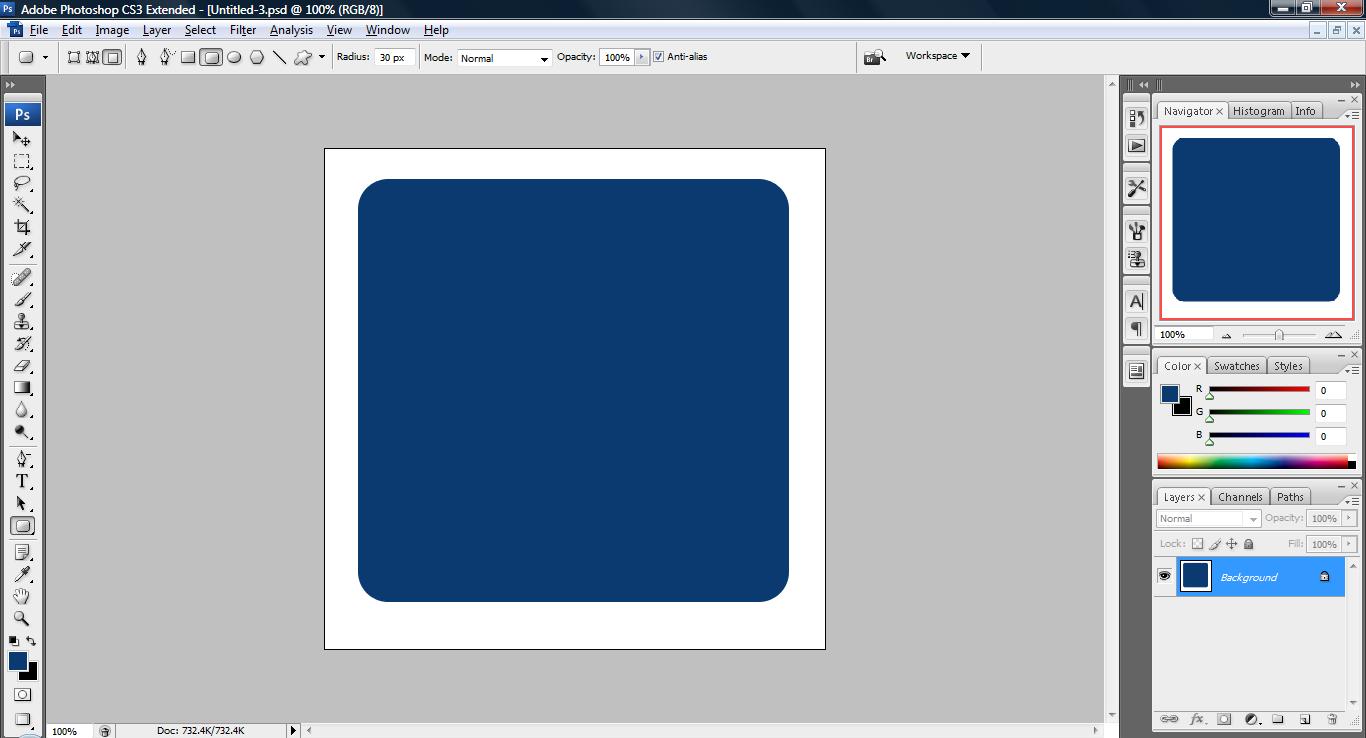
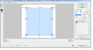
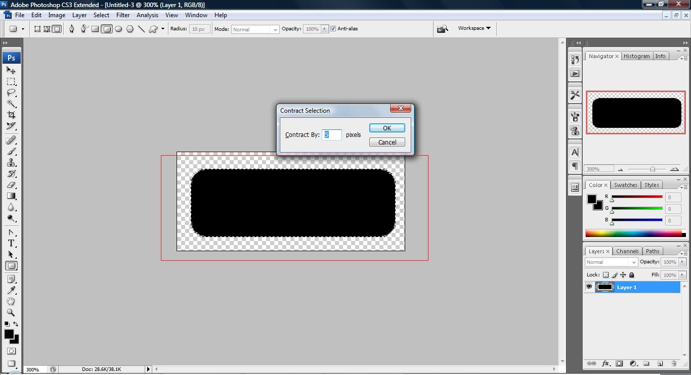
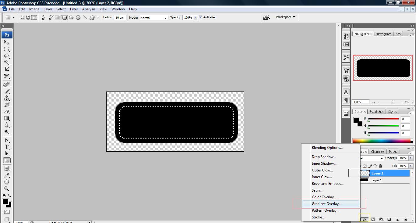
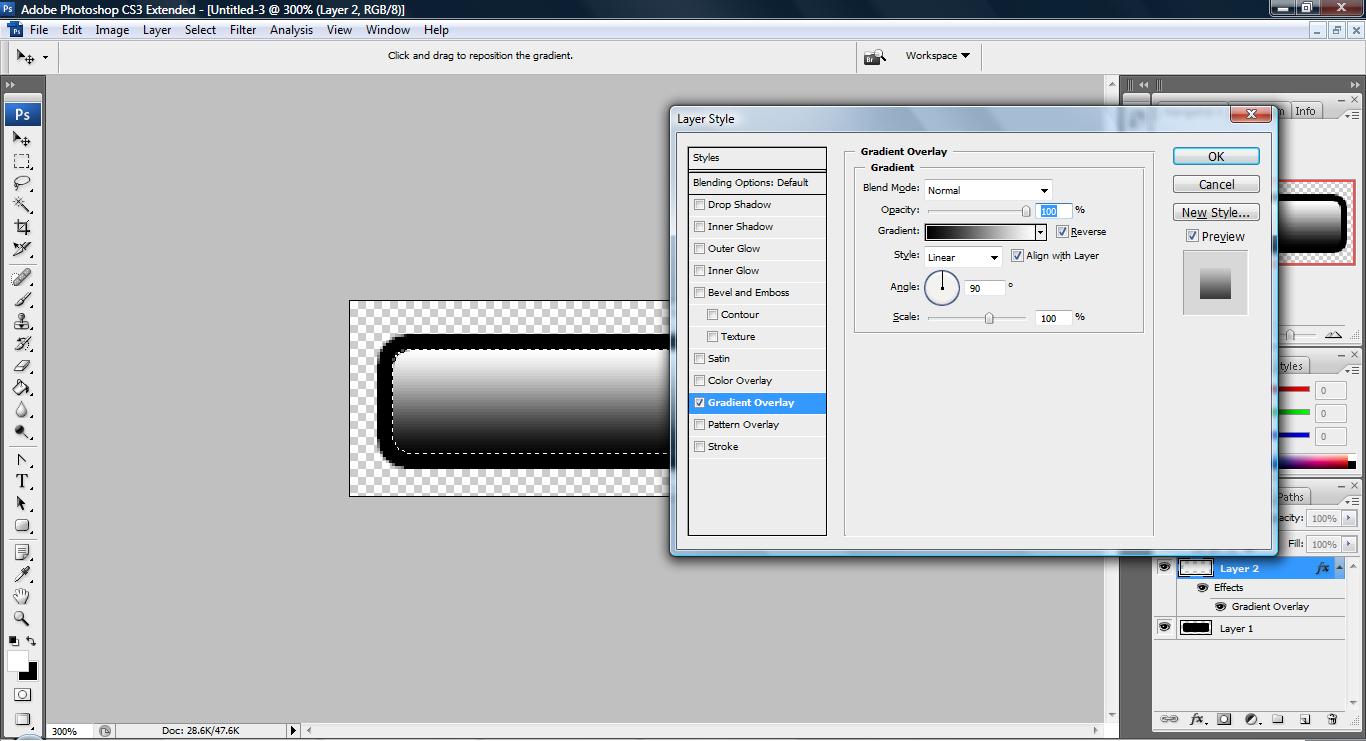
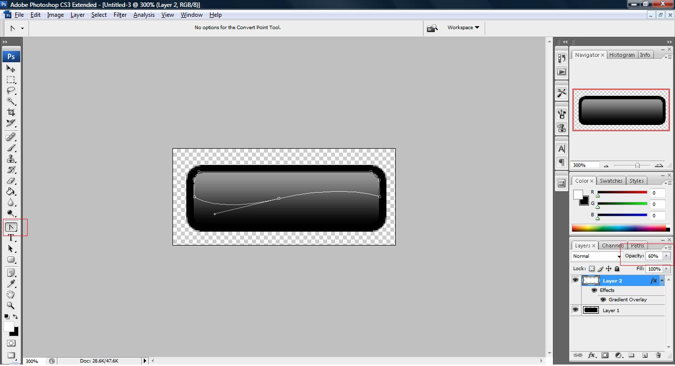
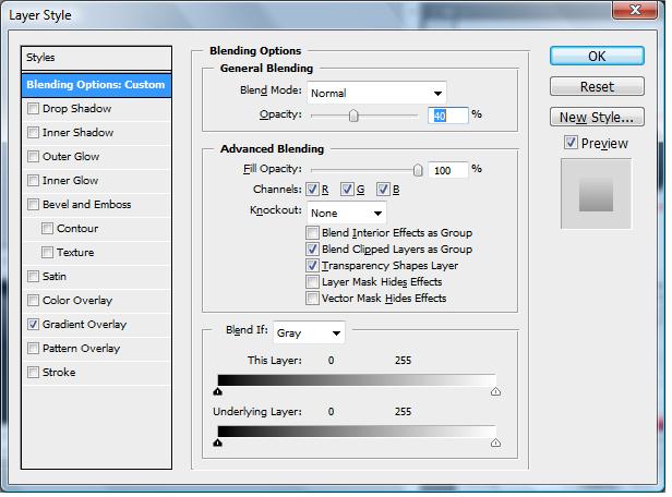
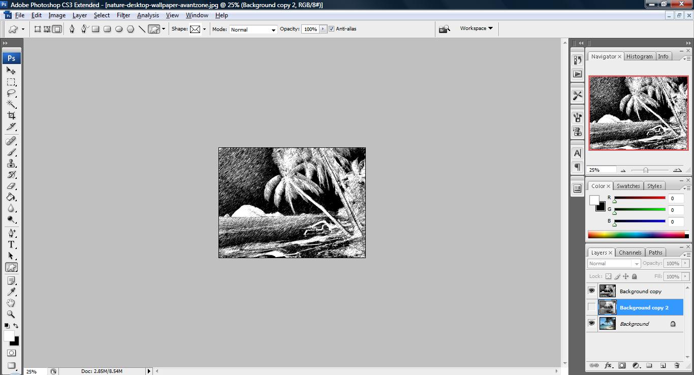
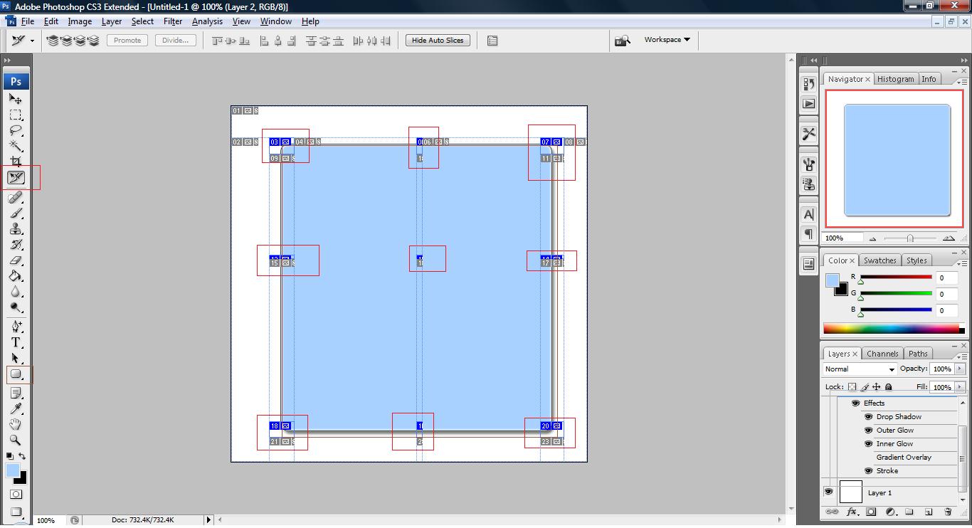
1. Fire up your photoshop and draw an rounded rectangle with the following slices made.

- Red: Slice option
- Gray: Style made
- Brown: rounded rectangle object used
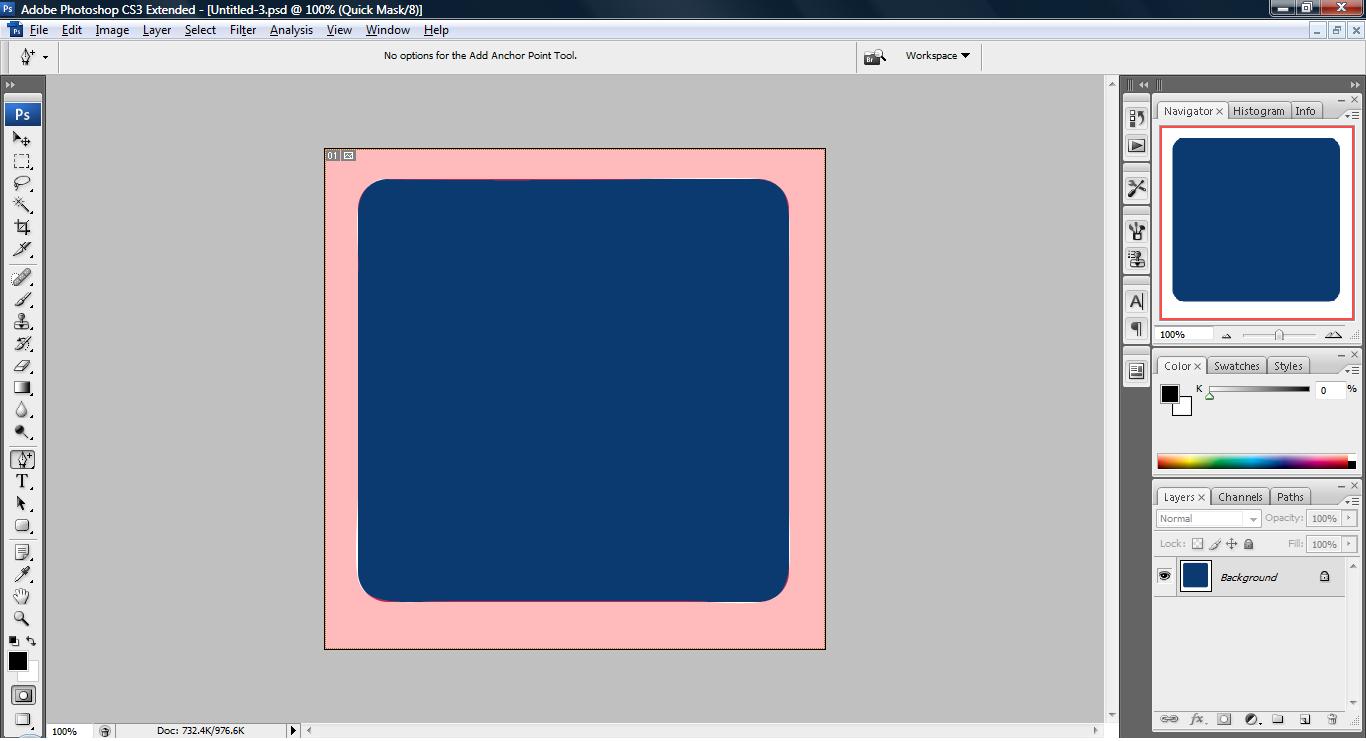
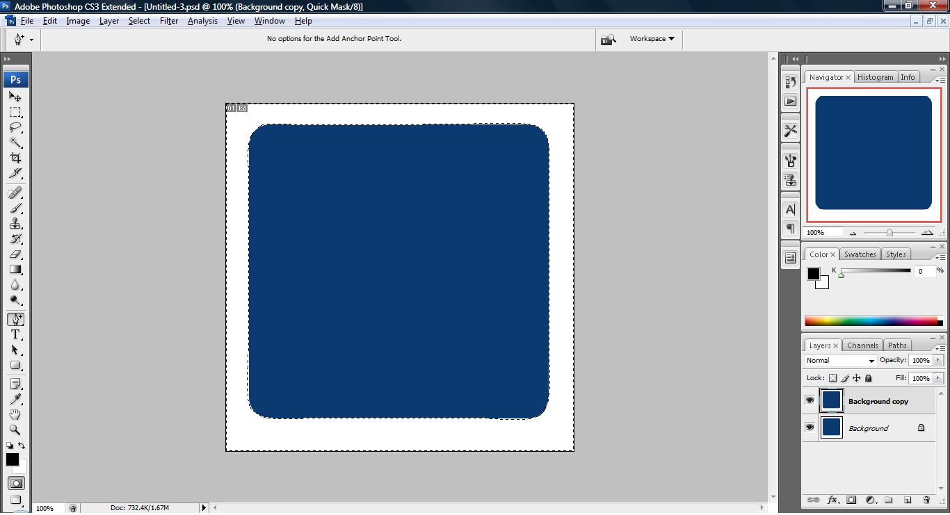
2. Once you have done the above, click File->Save For Web & Devices.. and ensure that the image is .png extension so that it support transparency for those who are dealing with DHTML application.
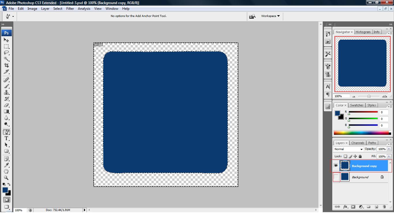
3. Once this is done, you will have the images you need for your CSS to create a curved border div. Now, we will proceed to code our CSS.
CSS code:
body
	{
	margin: 0;							/*set the page margin to 0*/
	padding: 0;							/*set the page padding margin to 0*/
	text-align: center; 				/*set the page alignment of our div to center*/
	}

#box
	{
	margin: 15px auto;					/*set the div to center with top and bottom 15px*/
	text-align: left;					/*set the div alignment to left*/
	width: 55em;						/*set the div size to 55em*/
	word-wrap:break-word; 				/*set the div word-wrap for ie5.5 above so that it will break to next line if it gets over horizontally*/
	overflow: hidden;					/*set the div word to be hidden if it goes over the right border for other browser*/
	background-image:url(images/c.png); /*set the div color with our image*/
	background-repeat: repeat;			/*repeat the image of our background*/
	}

#content
	{
	padding:3em; 						/*set the padding of our div content so that it will be nicely written with a fair amount of space*/
	}

/* ---=== border code follows ===--- */
/*
	tlc = top left corner
	trc = top right corner
	blc = bottom left corner
	brc = bottom right corner
	l = left border
	r = right border
	t = top border
	b = bottom border
*/

#tlc, #trc, #blc, #brc
	{
	background-color: transparent;		/*set background color to transparent for our 4 corner so that it will not go overlapped*/
	background-repeat: no-repeat;		/*set background to only display once for our 4 corner*/

	}

#tlc
	{
	background-image:url(images/tlc.png); 	/*set top left hand corner image*/
	background-position: 0% 0%;				/*set the position to start at 0,0, top left*/
	}

#trc
	{
	background-image:url(images/trc.png);	/*set top right hand corner image*/
	background-position: 100% 0%;			/*set the position to start at max width,0, top right*/
	}

#blc
	{
	background-image:url(images/blc.png);	/*set bottom left hand corner image*/
	background-position: 0% 100%;			/*set the position to start at 0,max height, bottom left*/
	}

#brc
	{
	background-image:url(images/brc.png);	/*set bottom right hand corner image*/
	background-position: 100% 100%;			/*set the position to start at max width,max height, bottom right*/
	}

#t
	{
	background-image:url(images/t.png); /*set the top border image*/
	background-position: 0% 0%;			/*set the position to start at 0,0, top left*/
	background-repeat: repeat-x;		/*repeat the top border image in x-axis*/
	}

#b
	{
	background-image:url(images/b.png); /*set the bottom border image*/
	background-position: 0% 100%;		/*set the position to start at 0,max height, bottom left*/
	background-repeat: repeat-x;		/*repeat the bottom border image in x-axis*/
	}

#r
	{
	background-image:url(images/r.png); /*set the right border image*/
	background-position: 100% 0%;		/*set the position to start at max width,0, top right*/
	background-repeat: repeat-y;		/*repeat the right border image in y-axis*/
	}

#l
	{

	background-image:url(images/l.png); /*set the left border image*/
	background-position: 0% 100%;		/*set the position to start at 0,max height, top left*/
	background-repeat: repeat-y;		/*repeat the left border image in y-axis*/
	}
HTML code:
<html>
<head>
<style>
<!--- CSS HERE -->
<!-- -->
</style>
</head>
</body>
<div id="box">
<!--- box border -->
<div id="l">
<div id="r">
<div id="b"><div id="blc"><div id="brc">
<div id="t"><div id="tlc"><div id="trc">
<!-- -->
<div id="content">
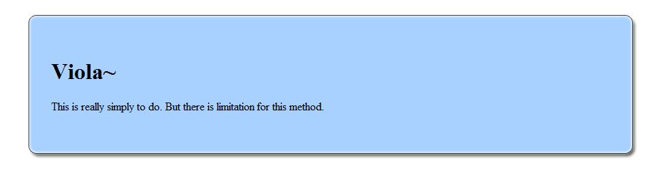
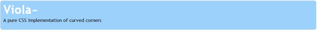
<h1>Viola~</h1>
<p>
This is really simply to do. But there is limitation for this method.
</p>
</div>
<!--- end of box border -->
</div></div></div></div>
</div></div></div></div>
<!-- -->
</div>
</body>
</html>
The HTML code and CSS are all explained on the code itself, the method use here is to pin 4 image on each edge and repeatingly putting image on the top and bottom in the direction of y-axis and x-axis. Lastly, we place an image which we took from the center of the image we created and place it as background of our content. You guys can download the above example code from curved-border. Please take note that the image you create on photoshop MUST be image with background color or else it will screw up the layout.
This technique is good with image that contain style such as shadow, glow etc. on its border. It allows user to text as long as they wish to provided they do not type 200 words continuously without space which will cause the word to go over the border.
This method should work for IE5.5 above, Firefox 1.0 above and other browser shouldn't have any issue with this.
Pure CSS

body{padding: 20px;background-color: #FFF;font: 100.01% "Trebuchet MS",Verdana,Arial,sans-serif}

h1,p{margin: 0 10px}

h1{font-size: 250%;color: #FFF}

p{padding-bottom:1em}

div#box{ margin: 0 10%;background: #9BD1FA} /* set the margin to top-bottom, 0, left-right, 10%*/

/*key to curve is display:block*/
b.rtop, b.rbottom{display:block;background: #FFF}
b.rtop b, b.rbottom b{display:block;height: 1px;/* anything over the x-axis border will be hidden*/
    overflow: hidden; background: #9BD1FA}

/*form 3 layer which creates the curve*/
b.r1{margin: 0 5px}/*set the margin to left right with 5px of space*/
b.r2{margin: 0 3px}/*set the margin to left right with 3px of space*/
b.r3{margin: 0 2px}/*set the margin to left right with 2px of space*/

/*define a larger area can be remove but the curve won't look nice*/
b.rtop b.r4, b.rbottom b.r4{margin: 0 1px;height: 2px}
The explanation has been embarked in the code itself. The key to make this work is display:block without this, the border will not work regardless of the method used above. The theory in creating this is to form a pyramid like structure on both top and bottom and highlight the other background as the color used to structure the pyramid. Of course, the pyramid i'm talking here isn't the triangle shaped pyramid but the base line of the shaped structure(the first few layer). You can grab the code in pure-css.
CSS3
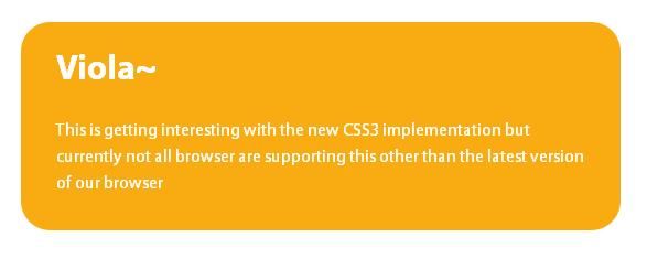
The new implementation of CSS3 and above have many enhancement, one of it is a way to curve your corner without using any images with few simple code. However, this will only work for certain browser and not all browser support this method yet. However, the below code will work fine with Firefox and Safari for now.(means no no IE for ya)
CSS code:
body {
	font: 100%/1.5 "Myriad Pro","Myriad Web","Lucida Grande","Trebuchet MS","Tahoma","Helvetica","Arial",sans-serif;
	color: #fff;
	margin: 2em; 0 0 2em;

}

.box {
	width: 30em;
	background: #f9ac11  left top no-repeat;
	padding: 1em 2em;
	-moz-border-radius: 1.6em;
	-webkit-border-radius: 1.6em;
	border-radius: 1.6em;
}

h1 {
	margin-top: 0;
}
Others are basically the same other than the one highlighted in red. You can have a look on the code in roundercurve. This do work for IE with a little extension needed but require constant upgrade of the extension when new browser emerge to the market.
Limitation
All of the above technique mention above all have one similar weakness, they are all unable to automatically wrap the text within the div itself if the text typed do not have space and is very lengthy. The solution to this problem is to use server scripting such as PHP which has a built-in method 'wordwrap' or just try to contain your text while writing a post. Some uses javaScript to automatically breaks to the next line when the text goes over a certain define width but this degraded the performance of the overall site itself.
However, this situation happen rarely as user usually do not type a sequences of 200 words without a space in between? Cases such as this is rare and usually won't be a problem after overflow:hidden is written in the css. ( we hid it )


